Interactive Systems
At its broadest, an interactive system can be any technology intended to help people complete a teask and acheive their goals, however this could include things like pens, which could help acheive the goal of leaving a message for a friend, so we tighten this definition to be any technology incorporating some form of electronic logic designed to help people complete tasks/acheive goals.
Alternatively, we could define this as any complex system with a UI. That is, something we need to give instructions to and know the status of in carrying out those instructions. These things are called systems (or artefacts), which we have dialogues with. Having dialogues with non-humans (and other animals) is a relatively new concept over the past 50 years.
Usability
For many years, the key has been thought to be making interactive systems usable, i.e., giving them usability.
To be usable a system needs to be effective. The system supports the tasks the user wants to do (and the subcomponents of such tasks).
We could also consider other components to make things usable. Efficiency - the system allows users to do tasks very quickly without making (many) errors; Learnable - the system is easy enough to learn to use (commensurate with the complexity of the tasks the users want to undertake); Memorable - the system is easy enough to remember how to use (once, learnt) when users return to asks after periods of non-use.
We are now moving beyond that to consider satisfaction - the system should make users feel satisfied with their experience of using it.
Positive user experience, rather than usability has now become the focus of the design of interactive systems, particularly as we have so many systems that are for leisure, rather than for work. This expands usability to cover issues such as:
- Enjoyable
- Fun
- Entertaining
- Aesthetically pleasing
- Supportive of creativity
Another way to think about usability is for the user interface to be transparent/translucent to the user - the user should be concentrating on their task, and not on how to get the system to do the task. This might not be the case originally however, though. For example, with the pen, you had to think about it when younger and how to use it, and now you don't.
Difficulty in Designing Interactive Systems
Designing interactive systems on computer systems for non-experts has only been developed for 25 years, whereas something like teapots has had 4000 years to be perfected (and still has dripping spouts!). Books have had 500 years to develop systems containing the best design features (page numbers, table of contents, index, chapter numbers, headings, etc) and books can be used as interactive systems.
Affordance
Some things, e.g., doors, have a method of use which is ambiguous. Doors should afford opening in the appropriate way, their physical appearance should immediately tell you what to do.
Affordance could be formally defined as: "The perceived and actual properties of an object, primarily those properties that could determine how the object could possibly be used" (Norman, 1998).
Affordances could be inate, or perhaps culturally learnt, but a lifetime of experience with doors, etc, means the interface to these systems is (or should be) transparent. Well designed objects, both traditional and interactive have the right affordances.
Are Current Systems Sufficiently Usable?
It's been estimated that 95% of functions of current systems are not used, either because the user does not know how, or doesn't want to. One of the causes of this is that anyone can use a computer these days.
Key Principles of Interactive Design
- Learnability - how easy the system is to use
- Memorability - how easy is the system to remember how to use
- Consistency - to what extent are similar tasks conducted in similar ways within the system (this will contribute to learnability)
- Visibility - to what extent does the system make it clear what you can/should do next
- Constraints - design the system so that users won't make mistakes and won't be led into frustrating/irritating dead ends
- Feedback - provide good feedback on the status of the system, what has happened, what is happening, what will happen
Interaction Styles
We need to get computers and complex systems to do things - somehow we have to "tell" them what to do. In turn, they have to give us information - the status of the system, what to do next, what's wrong, how to fix it.
One metaphor for this is to consider interacting with these systems as a dialogue - you tell/ask the system to do something, it tells you things back; not too dissimilar to having a conversation with a human being. Another metaphor is to consider these systems as objects that you do things with and interact with (for example, putting waste in a waste paper bin), or as navigating through a space and going places (the web).
Command Line Dialogue
This style is not widely used, but is useful to understand it to consider more recent and long-term developments. This is the first interaction style that appeared on PCs, taking over from mainframe systems.
The conversational metaphor applies here, where you're talking to the computer through your keyboard and it reacts. However, the language you speak in must be correct to the last dot and in the correct order, much like speaking a foreign language. The system doesn't give you any clues on what to do, so you must remember (or use a crib sheet), the syntax of the language. These commands can get quite long and complex, especially when passing lots of options and (in UNIX), piping one command to the other.
You also get limited feedback about what is happening, a command such as rf may return you directly to the command line, after deleting 0 or 100 files. The later versions of DOS took the feedback step too far, however, asking for a confirmation of every file by default. This is programmed by the interaction designer, and they have to remember to do this and get the level of interaction right.
If you do get the command correct, however, this can be a very efficient way of operating a complex system. A short, but powerful, language allows you to acheive a great deal and people are willing to invest the time to learn this language to get the most efficient use of the system.
However, although computers are good at dealing with cryptic strings, complex syntax and an exact reproduction of the syntax every time, humans aren't. This interaction system stemmed from the fact that processing power was expensive, so humans had to adapt to the way computers needed to interact, not vice versa. This is no longer the case.
Menu Interaction Style
Although the command line style was good for experts, it wasn't for novice of infrequent users, so an interaction style was developed which is almost the complete opposite of command line dialogue in terms of strengths and weaknesses - menus.
Menus are simple, as not much needs to be remembered as the options are there on screen and the physical interface corresponds directly to the options available. Feedback is immediate - selecting an option will either take you to another screen of menus or to perform the selected task.
Feedback is natural and built in -you can see whether you are going the right way, because either something relevant occurs - much like handling objects gives you instant built in feedback.
Selections from objects (such as radio buttons) can be thought of as a menu, even though the selection method is different.
Menu systems should be usable without any prior knowledge or memory of previous use, as it leads you through the interaction. This is excellent for novice and infrequent users (hence their use in public terminals of many varieties). However, a complex menu structure can complicate matters where particular features will be found (e.g., IVR systems)
Expert and frequent users get irritated by having to move through the same menu structure every time they do a particular task (hence shortcut keys in applications such as Word), and menu systems also present a lack of flexibility - you can only do what menu options are present for you, so menu driven systems only work where there is a fairly limited number of options at any point. Items also need to be logically grouped.
Form Fill-In Interaction Style
A form is provided for the user to fill in. Perhaps not the most revolutionary or interesting of interaction styles, but it is based on another real world metaphor - filling out a paper form. This also illustrates another problem with metaphors, not everything transfers well from one medium to another.
Forms present lots of little problems:
- How many characters can be typed in the field - this is often not clear, and there is no inherent indication of this (needs to be explicitely built in by the interaction designer) - this violates the feedback principle.
- What format is supposed to be used - particularly for things like dates
- Lack of information - what if all information known by the form isn't available immediately. The design may not let you process beyond the dialogue box
However, this system does have strengths. If the system is well-designed, any novice can use them and it has a strong analogy to paper forms, and the user can be led easily through the process. However, they are easy to design badly, and hence confuse and irritate the user.
Direct Manipulation
The heart of modern graphical user interfaces (GUIs, sometimes referred to as WIMP - Windows, Icons, Mouse/Menus, Pointers) or "point and click" interfaces is direct manipulation (note, GUI and WIMP themselves are not interaction styles).
The idea of direct manipulation is that you have objects (often called widgets) in the interface (icons, buttons, windows, scrollbars, etc) and you manipulate those like real objects.
One of the main advantages of direct manipulation is that you get (almost) immediate natural feedback on the consequences of your action by the change in the object and its context in the interface. Also, with the widgets being onscreen, you are provided with clues as to what you can do (doesn't help much with items buried in menu hierarchies). The nature of widgets should tell you something about what can be done with them (affordance), and with widgets, many more objects can be presented simultaneously (more than menus).
However, interface actions don't always have real world metaphors you can build on (e.g., executing a file) and information rich interactions don't always tend to work well with the object metaphor and direct manipulation becomes tedious for repetitive tasks, such as dragging, copying, etc...
Natural Language Interfaces
The ultimate goal of the conversational metaphor is for us to have a dialogue with the computer in our own natural language. This might be written, but spoken seems easier. Voice in/voice out systems have been developed, where the computer recognises what you say (using speech recognition technology) and produces a response, spoken via text-to-speech (TTS).
This kind of system should be "walk up and use", just speak your own language and this should suit both novices and expert users. This isn't yet technologically feasible, as the AI is largely fake and can only recognise key words. If speech recognition fails, it is easy to get into nasty loops, where it is not clear as to how you get out again (this is the feedback principle). There is also the problem of different accents and recognising older voices, and privacy and security issues are introduced.
Design Lifecycles
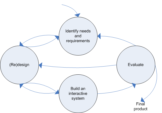
How do we get from interaction ideas and information about the users and how the users would like the system to workto an elegant, interactive system? Methods are needed to structure and organise the work, so one of the key points is to involves users in all phases of design. It's argued that it is too slow and and difficult to involve users in the design cycle, so how can this be tackled?
A number of different theories and methods are developed to describe the methods. In HCI, these are called design lifecycles, and all lifecycle theories and models include four basic components, although they emphasise different aspects of them. These components are:
- Identifying user needs/requirements
- Developing (alternative) designs
- Building (prototype) versions of the designs
- Evaluating designs
Before we can continue, we need to consider what we mean by the term users. We can consider three levels of users:
- Primary users - regular/frequent users of the system
- Secondary users - occasional users of the system, those who use the system occasionally, or only through an intermediary
- Tertiary users - those affected by the system introduction, or who will influence purchase of the system
You can also consider stakeholders "people or organisations who will be affected by the system, and who have a direct or indirect influence on the system requirements".
Waterfall Model
See MSD.
The advantages of the waterfall model is that each stage produces a set of specifications that can be handed on to the next stage, and the work is compartmentalised into clear chunks. There is some feedback from each stage back to the previous one, but this slows down the whole process.
With the waterfall model, it is very problematic to change the requirements as the project develops, and is difficult to consider alternate designs. Any change in design ideas are difficult to implement, as the system must be recoded.
Spiral Model
See MSD.
This model never really gained acceptance in the long-term in software engineering, or in human-computer interaction.
In the 1980s, two models emerged from work on HCI, instead of software engineering, like the waterfall and spiral models. These models focus on the need to build interfaces and interactions to meet the needs of the users.
The Star
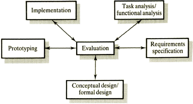
Here, evaluation is at the centre of the design process; we must be doing evaluation at all stages of the design process, and we move around the star from analysis clockwise.
We can consider two modes of design activity:
- Analytic mode - top-down, organising and formal; working from the systems view towards the user's view
- Synthetic mode - bottom-up, free-thinking, creative and ad-hoc; working from the user's view to the systems view
Interface designers need to flip between these two modes.
The star lifecycle captures something important about the real design process - that we need to work from both ends of the problem, from the user's perspective and from the perspective of the technology, but it doesn't tell us very much about the ordering and nature of the different processes involved in design and how to move a design forward.
Iterative User-Centred Design
This method was developed by Jack Carroll and colleagues and has the advantage of there being numerous opportunities to include user requirements and alter specifications as new knowledge is developed from studying prototypes. You are not committed to genuine coding until a satisfactory design has been prototyped.
The problem with this method is that you do not always know when to break out of the cycle. Evaluating a prototype may not be accurate and may not reveal all of the problems in the prototype.
Usability Engineering Lifecycle
The UE lifecycle takes a combination of HCI and software engineering methods, and is more useful for big systems. It is not as much a new concept (despite being recent - Mayhew, 1999), but it brings together lots of previous ideas and takes the best bits from previous methods.
Here, the lifecycle is divided up into three phases.
Requirements Analysis
This consists of user profiling (understanding the users), task analysis, consideration of technical and platform-related capabilities and constraints and the establishment of general design principles - a definition of your usability goals, sometimes called a style guide or initial design specification.
Design/Testing/Development
This can be broken down into three levels. At level 1, this is the conceptual model or design, a mock-up (lo-fidelity prototype), which is evaluated to eliminate major design flaws. Level 2 is the screen design standards (SDS), designing the basic interaction styles, screens and then evaluating these. This sub-phase should allow testing against usability goals. Level 3 is the detailed interface design, a fine-grained design of the interface and interaction, which allows further testing against usability goals.
Installation
This is the coding of the real system, where feedback from users working with the real system (beta testers) is used.
This method has the advantage of stressing lots of user testing and involvement and divides the development into clear phases of an increasingly realistic design, but it is difficult to change requirements as you learn about the user's understanding of, and interacting with the system.
Scenario-based System Design
This was based on further development by Carroll and Rosson in 2002 and evolved from the difficulties of using multi-disciplinary teams for system development. How can all these people work together and understand each others visions and problems? This method believes you can do everything up until the implementation phase.
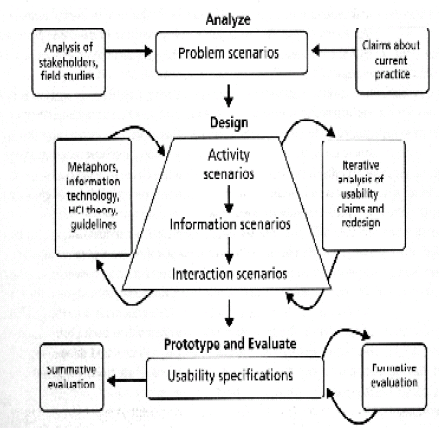
This system is based around scenarios, or stories, which elaborate the design and then proposed design solutions are written for the problems. These start looking quite simple, but increase in complexity as the design is articulated.
All scenarios have characteristic elements:
- Setting - situation elements that explain or motivate goals, actions and relations to the actors
- Actors - humans interacting with the technology or other setting elements or personal characteristics relevant to the scenario
- Task goals - effects on the situation that motivate actions carried out by the actors
- Plans - mental activity directed at converting a goal into a behaviour
- (User) Evaluation - mental activity directed at interpreting features of the situation
- Actions - observable user behaviour
- Events - external actions or reactions produced by the computer, or other features of the settings; some of these may be hidden to the actors, but important to the scenario
The first step is to write a problem scenario, which is representative of the current situation. There may be many of these to cover a variety of actors/situations, etc. They are not called problem scenarios because they emphasise problematic aspects of current practices, but because describe activities in the problem domain.
The next step is claims analysis, where each feature is identified and then the positive and negative effects listed. Claims analysis may lead to elaboration of scenarios. To move forward from the claims analysis, you should only have positive features.
The next step is to write activity scenarios - what and how an activity is going to address a problem is the focus of activity scenarios. Only high levels of abstraction need to be considered, no specific details. The design team first introduces concrete ideas of new functionality and new ways of thinking about users' needs. As in other steps in the process, a claims analysis is generated to help identify tradeoffs as you move forward with prototypes.
Further levels involve rewriting the scenarios at higher levels of detail (or lower levels of abstraction, depending on how you want to look at it), and dealing with new issues which are caused. Information and interaction design scenarios specify representations of a task's objects and actions that will help make users perceive, interpret and make sense of what is happening.
The goal of interaction design is to specify the mechanisms for accessing and manipulating the task information and activities.
See MSD.
After all of these stages, we can move onto UML, etc and treat it like a classic design problem.
This does have the advantage of allowing quite detailed development of the design without committing to coding or prototyping and makes it easier to change requirements and consider alternative designs, however, we must consider the disadvantages of not giving the users hands-on experience with even lo-fidelity prototypes which may inform the views of the designers. All prototypes are created after the design has been set. It is difficult to measure against usability goals until late in the process.
Gathering Requirements for Designing Interactive Systems
How do we find out what users really want in an interactive system?
Unfortunately, it's still very typical for developers to say "we could be users of this system and we like/understand/can use it, so it must be okay". Even if you are part of the target user group, if you have helped develop a system, it's inevitable that you will like and understand it, so trying to establish requirements and then evaluate it on yourself is invalid. You must have independent people outside the development group, whom you involve in establishing requirements and doing evaluations. Ideally, these should cover the full range of users, not just the core group (in which case, the development team probably isn't diverse enough anyway). So, you need to think about the range of users for the system - men/women, children/young/middle-aged/old, expert/novice with technology, and you need to make sure the full spectrum is represented in the people you involve in requirements and evaluation
In software engineering, you typically have different types of requirements - functional and non-functional. Functional requirements are physical attributes/functions of the system/product - basically, what it does. Non-functional is how well it does this. For a mobile phone, a functional requirement may be that the phone allows users to store common numbers in an address book and a non-functional requirement may be that it can receive calls in 95% of urban requirements.
Because the design of interactive systems includes such a variety of systems, tasks, users and contexts, the types of requirements have been expanded. We still have functional requirements, but non-functional requirements are broken up into more specific requirements:
- Data requirements - Lots of interactive systems deal with data and users have requirements about how its handled
- Environmental requirements, or the contexts of use, which themselves can be split up into:
- Physical requirements - e.g., the system must be usable in a wide range of lighting conditions, in noisy conditions and in extremes of heat (consider things like using gloves with the system)
- Social requirements - Will the user be solo, or working in a group? e.g., laptop computers designed for solo use and with privacy, but sometimes the workspace wants to be shared. Will collaborators be in the same physical space or remote from each other?
- Organisational requirements - Will the user have technical and training support? Is sharing and collaboration encouraged, or is authority and heirarchy important? What is the communications infrastructure like - broadband, omnipresent, stable?
- User requirements - The specific requirements of the intended user groups. You can try to define a "typical user" or a range of "user profiles"
- Usability requirements - These try to capture the usability goals and measurable criteria. These could be very general, such as "easy to use", or very specific "95% of users between the age of 18 and 60 should be able to withdraw £50 within 60 seconds with a satisfaction rating of 4/5".
There are problems that you can come across when eliciting requirements from users. We need to find out what people want before we start developing new interactive systems. If there is an existing technology in use, or an existing system, even if it's rather low-tech, we can start by studying how users interact with that system, what problems they have and ask them how they would like it improved.
Often, however, this situation isn't as simple - new interactive systems are highly innovative and allow us to do completely new things (e.g., MP3 players). Before we have them, if you ask users how they would like them, they won't have any idea as they can't imagine how they would use them. Users often find new ways of using systems once they have them - the first killer application for PCs was word processing - not spreadsheets and databases as had been predicted; no-one predicted the rise in SMS on mobile phones.
Nonetheless, we still need to involve users from the very beginning in the design process. We can get them to participate in the creative process of developing a completely new interactive system or improving on an existing one. There are two basic ways of eliciting requirements:
- Ask (potential) users questions
- Observe them doing things (with non-interactive systems or with older interactive systems)
Examples of question asking techniques include:
- Questionnaires
- Interviews
- Focus groups and workshops (perhaps better to call these discussion techniques as well as question asking techniques)
And examples of observational techniques include:
- Naturalistic observations
- Think aloud protocols
- Indirect observation (unobtrusive methods)
Questionnaires
Questionnaires are produced in a written format that requires very careful work (piloting and refining a questionnaire) to ensure that the questions are absolutely clear to all respondents and that you are collecting all the information you need.
Questionnaires are good for when the issues you want to address are well-defined (e.g., finding out problems users are having with a current system to be improved) and you need to get information from a lot of people in a way that can be relatively quickly analysed. Conversely, they are less good for situations where the questions are not very well defined (e.g., when developing a very novel system) and the response rates for questionnaires are very low - 40% is considered good.
The better a questionnaire is, the more likely it is to have a higher return rate, and your data will also be of better quality. Following up questionnaires with reminder letters, phone calls and e-mails, as well as offering incentives such as offering raffles all improve response rates also. The length of the questionnaire should be commensurate with the importance of the topic, but 20 minutes is too long for any questionnaire.
There are three types of questions on questionnaires:
- Open-ended - a completely free response. This is good when you want to elicit all kinds of information, want respondents to be creative (many enjoy this) and you don't know what they might say. It is more difficult to analyse, however, particularly if you have lots of respondents - you need to develop your own categories to group the answers, and the problem is then to decide whether two differently worded answers are the same category. This is often biased, so two people often need to look at the answers.
- Closed questions - These are yes/no-style questions with a limited set of options, often with "Don't Know" or "Other" as an option (these answers are desired in less than 10% of cases, however). The options for closed questions can often be decided from doing a pilot open-ended question and then using the answer grouping from that to decide the closed question answers. Closed questions are easy for respondents to answer and good for getting lots of data that's easy to process and understand. It is fundamentally categorically in nature, however - answering "what" type questions, not on how people found something to use. These quantitative questions are very useful in designing systems - you may want to compare different designs, or compare one design as it evolves over time. Eliciting extreme information from people ("What did you like most/least about X?") is also good.
- Likert scales - These are a very simple and neat way of measuring "how much" type questions. The Likert (or rating) scale gives a scale from 1-5, where 1 is agree and 5 is disagree (or could use 5, 7 or 9 gradations, depending on how much you want the respondents to discriminate). Likert scales are very useful and should be used for everything (according to Helen). They can be combined with open-ended comments where users can justify their ratings. The disadvantage from Likert scales is that people can express no strong preference either way. When you're comparing multiple examples and want to know the best one, asking people to rank their options in order can often be more useful.
There is a checklist to creating a good questionnaire:
- Make questions clear - avoid double-barreled questions (e.g., "Do you think it'll be useful to make the icons or buttons larger?" - does the answer refer to the icons or the buttons?).
- Make questions specific - the generalising should be done by the analyist, not the respondent. (e.g., "How many hours do you use the Internet a week?" - the respondent here is trying to average in their head. It's better to ask just about yesterday and then multiply by 7 and take into factors like weekends - this is the same as what the respondent is doing, but you're likely to do it better with a better process).
- Think about the ordering of the questions - Ask easy questions first and get the respondent relaxed and lulled into a false sense of security. They are more likely to complete a questionnaire once they have started it. Personal questions should be asked last (people don't like answering these, but if they're completed the rest of the questionnaire, they probably will). Does answering one question lead you into answering another one in a certain way?
- Make scales intuitive, clear and consistent - if you use numbers, 1 = low agreement and 5 = high. This is intuitive. Also, when asking closed questions, questions should be either positive or negative - mixing them up occasionally does keep respondents on their toes, however!
- Avoid technical or HCI jargon (e.g., when navigating about a website, a lot of people link navigating with ships and compass).
- Provide clear instructions on how to complete the questionnaire and specific questions (people will ignore you, but at least you tried). Examples often help.
- Clear layout is important and helpful - enough room is required for open questions, but a balance is required between a lot of whitespace (which can give an intimidatingly long questionnaire) and room.
Interviews
Interviews can range from the very formal, rather like a questionnaire given face-to-face, to very informal, where the interviewer has a set of topics, but has a very free ranging conversation with the interviewee. A lot of the principles from questionnaire design still apply to interviews - clear question design, ordering of questions, etc, etc.
Interviews allow you to develop a relationship with the interviewee, and because you are talking, you can elicit much more information, as well as explaining things the interviewee might not understand and being able to tailor the questions to the interviewee much more easily.
Interviews are much more time consuming than questionnaires and the interviewee might feel a bit intimidated and may not reveal personal information. This method is also more prone to "researcher bias" - with the interviewee telling the interviewer what they want to hear, and not necessarily what they don't wish to hear.
Focus Groups
Normally, 5-7 people are brought together, usually from a particular user group to discuss a particular system/problem. They are facilitated by a researcher who has a list of questions/topics to be covered and who needs to discreetly guide the discussion. Focus groups normally last for about 2 hours and are a fairly time-efficient way of eliciting information and bouncing ideas around - people can spark ideas off each other. It is less good at eliciting personally sensitive data, however.
Observation
There are three basic types of observational studies:
- "Quick and dirty" observation (good for initial user requirements elicitation) - right at the beginning of the design process, you might want to get a general idea of how people are using a current technology (and the problems they are having), or how they might use a new technology - "quick and dirty" observation is a good way to accomplish this.
- Observation in a (usability) lab - if you want to study in detail how users interact with technology, you want to have them in a controlled laboratory setting. This allows us to observe how users undertake a range of tasks which are thought to be vital, to gauge performance and "affective" reactions (how they feel).
- Observation in field studies - for a variety of reasons you might need to take a really detailed look at the current use of technology (a "quick and dirty" observation may not reveal the problems). Also, when an early prototype is available, this method can be used for an evaluation use, where the prototype is used in a real world context.
There are also different levels of observer involvement; "insider-outsiderness". The most extreme level of this is that of total outsider, where the outsider does not participate in the situation at all (doesn't help people who get stuck or ask them about their experience), and the other extreme of this is marginal/complete participation, for example where an observer becomes part of a company and uses their system for a while, participating in the processes of the system. In the middle there are observers who also participate, by creating certain configurations to see how participants react.
Marginal/complete participation in observation is referred to as ethonography - a term from anthropology where anthropologists go and live in a different culture and participate in their lives in order to understand their customs. In both anthropology and HCI, this is a big undertaking, with researchers sometimes participating in the use context of a situation for months, if not years. It can be done on a small scale, however, with observing and interviewing users and the researchers trying out the technologies for themselves.
Observation can be considered as varying on a scale from hypothesis-driven (where you have a clear idea what you are looking for, what the problem is and what your theory is) to holistic (where you are not sure what's going on, what the problem is and what you are going to find), and this will influence exactly how your observations are done. With hypothesis-driven, it is clear what specific behaviours you should be observing in classrooms, whereas with holistic, you will need to observe everything and make sense of it later - there is a serious danger of drowning in the information you collect, however.
There are different methods to observe:
- Notes plus still camera - Taking handwritten notes seems the most basic way of noting down observations, but it is very difficult to write and observe at the same time, and very difficult to write quickly enough to give much useful detail later. A dictaphone could be used in a public situation to make up for this, and combining it with something like a hands-free kit can make it look like you're on a mobile phone, decreasing your obviousness. Taking still pictures of situations can be very useful, but it may upset observees in public situations (and has ethical implications). This method is okay for use in labs, and is possible, if difficult, in public.
- Checklists of behaviours - A list is made up of behaviours of interest, and all you need to do is simply check off whether and how frequently they occur. This is good is the observation is hypothesis-driven, but you may need a pilot study to work out the checklist. Once the checklist is working, it saves an enormous amount of effort collecting and later analysing the data.
- Audio recording plus still camera - Small, inconspicuous digital tape recorders are useful, but this only works if the participants are talking, and even then it is difficult to work out what is happening without visual record; still shots can help. If you choose to transcribe the whole conversation, this can be very time consuming, but it may not be necessary - relevant points and problems can be picked out and a summary generated.
- Video - This is good for capturing all visual and aural information, but it can be intrusive and make people feel self-conscious (although they usually forget about the camera when they are focussing on the technology). Video is very time-consuming to analyse (1 hour video = 100 hours analysis), but as with audio recording, it may be summarised with only important segments analysed in detail. Additionally, videoing public places may not capture all available information.
Frameworks have been developed for doing observation, as when performing observation, especially holistic studies, there is a lot of information to record and the appropriate information needs to be captured.
A very simple framework for field observation is the who/where/what framework. Who is the person using the technology (age, gender, type, etc) and are others involved? Where are they using it (the place) and what are the important characteristics of that environment? What is the thing/task of what they are doing?
A more complex framework has been developed based on the simple one above which considers more factors:
- Space: What is the physical space and how is it laid out?
- Actors: What are the roles and relevant details of those involved?
- Activities: What are the actors doing and why?
- Objects: What physical objects are present, such as furniture?
- Acts: What are specific individuals doing?
- Events: Is what you are observing part of a special event?
- Goals: What are the actors trying to accomplish?
- Feelings: What is the mood of the group and individuals?
In laboratory observation, one of the frustrating things is that you can get a lot of detail (particularly from video analysis) and still not know what is going on. In particular, we have no insight into the user's mental model of what is happening. A variation of pure observational technique has been designed to deal with this situation - this is called the "think aloud" or "concurrent verbal" protocol, where the person is asked to say out loud everything that they are thinking and trying to do, so that their processes (and mental model) are externalised. It is usually very straightforward to get the person to do this; they can be gently prompted if they go silent.
Alternatives to this include getting them to work in pairs and describe what they are doing to each other. In some situations, you can get one person to teach another how to do something.
For some tasks, it can be disruptive to get a person to talk whilst doing the task (e.g., something that requires a lot of concentration, or when talking is part of the task), so a variation on the above called retrospective verbal protocol can be used. Here, you video the person and immediately (while it's still fresh in their minds) get them to watch the video and talk through what they are thinking at the time. However, you often lose a lot of the finer detail of the thoughts going through your head, and it's often embarrasing to watch a video of yourself.
In some instances, actually observing people may be too intrusive. We can ask people to keep diaries of their behaviour, but this often falls off as people lose interest, and structure and incentives are needed. Another method is interaction logging, taking some kind of automatic log of the key presses, mouse movements and clicks, which gives us on a somewhat more meaningful level the menu items chosen, web pages and links visited, etc... This information by itself is not that useful - did the user find that page helpful/interesting/etc..., so it needs to be combined with video or audio recording from user, preferably with verbal protocol data.
Logging is a completely unobtrusive measure - the user does not need to know it is happening. Psychology has long liked the idea of unobstrusive measures like this, measures which do not interfere with the behaviour at all. HCI needs more useful unobtrusive methods.
Ethics
If we involve people in research, we have an ethical obligation to inform them that we are collecting data from them and using it. This is often a problem with observational data, particularly if it is collected in a public place and this ethical obligation is ignored. Unobtrusive methods are attractive specifically because they do not upset the naturalness of behaviour - informing people would definately do so. There is no easy way out of this, but the best rule of thumb is to get people's consent whenever you can. Collected research should be anonymous.
Task Analysis and Modelling
A user has goals and needs to know methods of acheiving these goals. The user needs feedback when the goals are achieved. A good interface can make it more or less easy to achieve these goals. We need to understand the user needs and their goals to design good interfaces.
A task is the set of activities (physical and/or cognitive) in which a user engages to achieve a goal. Therefore, we can distinguish between a goal, the desired state of a system, and a task, the sequence of actions performed to achieve a goal (i.e., it is a structured set of activities). Goals, tasks and actions will be different for different people.
Task analysis and modelling are the techniques for investigating and representing the way people perform activities: what people do, why they do it, what they know, etc. They are primarily about understanding, clarifying and organising knowledge about existing systems and work. There is a lot of common with systems analysis techniques, except that the focus here is solely on the user and includes tasks other than those performed with an interactive system. The techniques are applied in the design and evaluation of training, jobs and work, equipment and systems, to inform interactive system design.
In this module, we'll focus on task decomposition (splitting the task into ordered subtasks), but there are more advanced techniques covered in the textbooks - knowledge based techniques (what the user knows about the task and how it is organised) and entity/object based analysis (relationships between objects, actions and the people who perform them).
Task analysis involves the analysis of work and jobs and involves collecting data (using techniques such as interviews and observations) and then analysing it. The level of granuality of task analysis depends on various factors, notably the purpose of the analysis. Stopping rules are used to define the depth of a task analysis - the point at which it is appropriate to cease decomposing. User manuals often stop too early.
Some general rules of thumb for stopping rules is when the action is a complex motor action and no problem solving is involved, or when the user doesn't articulate any lower level activities. Other places to stop is when the likelihood and cost of error in the task are below a certain threshold, or when the sub-tasks are outside the scope of the current project.
Task modelling represents the results of task analyses as task models. There is no specific, correct model. Specific models describe one instance of a task as performed by one person. A generic task model generalises across many instances to represent the variations in the task.
Heirarchial Tasks Analysis
Heirarchial tasks analysis (HTA) is concerned with observable behaviour and the reason for this behaviour. It is less detailed than some techniques, but is a keystone for understanding what users do.
HTA represents tasks as a hierarchical decomposition of subtasks and operations, with associated plans to descibe sequencing:
- tasks/subtasks - activities to achieve particular goals/subgoals
- operations - lowest level of decomposition, this is the level defined by the stopping rule
- plans - these specify the sequencing of activities associated with a task and the conditions under which the activities are carried out
A HTA can be represented by a structued, indented text, or using a structured chart notation.
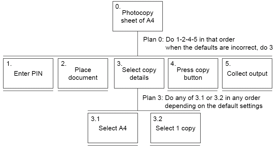
A text variant of the above structured chart may be:
- 0. To photocopy a sheet of A4 paper:
- Enter PIN number on the photocopier
- Place document face down on glass
- Select copy details
- Select A4 paper
- Select 1 copy
- Press copy button
- Collect output
- Plan 0: Do 1-2-4-5 in that order; when the defaults are incorrect, do 3
- Plan 3: Do any of 3.1 or 3.2 in any order; depending on the default settings
We can consider different types of plan:
- fixed sequence (e.g., 1.1 then 1.2 then 1.3)
- optional tasks (e.g., if the pot is full then 2)
- wait for events (e.g., when the kettle boils, 1.4)
- cycles (e.g., do 5.1-5.2 while there are still empty cups)
- time-sharing (e.g., do 1 and at the same time, do 2)
- discretionary (e.g., do any of 3.1, 3.2 or 3.3 in any order)
- mixtures - most plans involve several of the above
Is waiting part of a plan, or a task? Generally, task if 'busy' wait - you are actively waiting or a plan if the end of the delay is the event, e.g., "when alarm rings", etc...
To do HTA, you first need to identify the user groups and select representatives and identify the main tasks of concern. The next step is to design and conduct data collection to elicit information about these tasks:
- The goals that the users are trying to achieve
- The activities they engage in to achieve these goals
- The reasons underlying these activities
- The information resources they use
This steps can be done with documentation, interviews, questionnaires, focus groups, observation, ethnography, experiments, etc...
The data collected then needs to be analysed to create specific task models initially. Decomposition of tasks, the balance of models and the stopping rules need to be considered. The specific tasks models then should be generallised to create a generic task model - from each task model for the same goal, produce a generic model that includes all the different ways of achieving the goal. Models should then be checked with all users, other stakeholders, analysts and the process should then iterate.
To generate a hierarchy, you need to get a list of goals and then group the goals into a part-whole structure and decompose further where necessary, applying stopping rules when appropriate. Finally, plans should be added to capture the ordering of goal achievement. Some general things to remember about modelling are:
- Model specific tasks first, then generalise
- Base models on real data to capture all the wonderful variations in how people do tasks
- Model why people do things, as well as how
- Remember, there is no single, correct model
- Insight and experience are required to analyse and model tasks effectively and to then use the models to inform design
When you are given an initial HTA, you need to consider how to check/improve it. There are some heuristics that can be used:
- paired actions (for example, place kettle on stove can be broken down to include turning on the stove as well)
- restructure
- balance
- generalise
There are limitations to HTA however. It focuses on a single user, but many tasks involve the interaction of groups to people (there is a current shift towards emphasising the social and distributed nature of much cognitive activity). It is also poor at capturing contextual information and sometimes the 'why' information and can encourage a focus on getting the model and notation 'right', which detracts from the content. There is a danger of designing systems which place too much emphasis on current tasks or which are too rigid in the ways they support the task.
There are many sources of information that can be used in HTA. One such is documentation - although the manuals say what is supposed to happen, they are good for key words and prompting interviews, and another may be observation (as discussed above) and interviews (the expert: manager or worker? - interview both).
We could also consider contextual analysis, where physical, social and organisational settings of design need to be investigated and taken into account in design. For example:
- physical (dusty, noisy, light, heat, etc...)
- social (sharing of information/displays, communication, privacy, etc...)
- cultural (etiquette, tone, reading/scanning style, terminology, data formats, etc...)
- organisational (hierarchy, management style, user support, availability of training, etc)
GOMS
GOMS is an alternative to HTA that is very different. It is a lot more detailed and in depth and is applied to systems where timing and the number of keystrokes are vital. It is more complex to use than HTA, and it is not common. GOMS is an acronym for:
- Goals - the end state the user is trying to reach; involves heirarchial decomposition into tasks
- Operators - basic actions, such as moving a mouse
- Methods - sequences of operators or procedures for achieving a goal or subgoal
- Selection rules - invoked when there is a choice of methods
Prototyping
Users often can't say what they want, but as soon as you give them something and they get to use it, they know what they don't want. A bridge is needed between talking to users in the abstract about what they might want and building a full-blown system (with all the expense and effort that involves). The prototype is that bridge, it might be a paper-based outline of screens, a video simulation of interaction or a 3D cardboard mock-up of a device.
Prototypes are very useful for discussing ideas with stakeholders, and it encourages reflection on the design and allows you to explore alternative designs without commiting to one idea and to make ideas from scenarios that are more concrete.
Low fidelity (lo-fi) prototypes are not very like the end product and are very obviously rough and ready. They are cheap and simple to make and modify and it makes it clear to stakeholders that they can be criticised. They are fairly low risk; designers do not have much to risk with them, but they do not allow realistic use.
One form of lo-fi prototyping is storyboarding, a technique used in the film industry. A series of sketches, usually accompanied with some text (e.g., a scenario), show the flow of interaction. This is useful if you're good at sketching, otherwise it can be daunting.
Another method is using paper screenshots, where a sheet of paper or an index card is used for each page, and overview diagrams can be used to show links between screenshots. Some tools (such as Denim and Silk) exist to support this process, but they can keep the "sketchy" look of the prototype.
Another method is the Wizard of Oz system. In the 1980s, a prototype system was created for speech recognition. At the time, speech recognition was not currently available, so a fake system was used, where a human actually did the recognition. The term is now used for any system where the processing power is not implemented and a human "fakes" it. There is no need to deceive the user for a Wizard of Oz system as it can work perfectly well if the user knows it is a Wizard of Oz system.
High fidelity prototyping uses materials that you would expect to find in the end product or system and looks much more like the final system. For software, people can use software such as Macromedia Dreamweaver or Visual Basic, or in the case of web pages, writing prototype HTML code. With high-fidelity prototyping, you get the real look and feel of some of the functionality, it serves as a living specification, it is good for exploration of design features and evaluation and it is a good marketing and sales tool.
It can be quite expensive and time-consuming however, especially if radical changes are possible; developers are often unwilling to scrap high-fidelity prototypes. Evaluators tend to comment on superficial design features rather than real design and user expectations can be set too high.
When creating prototypes, you have to consider depth vs. breadth - do you prototype all of the functionality, but then not go into any specific detail (horizontal prototyping), or do you prototype one or more functions, but in a lot of depth (vertical prototyping).
Evolutionary prototyping also exists, which is where you build the real system bit by bit and evaluate as you go along, and the opposite is throw-away prototyping, which is where a prototype is built in one system (perhaps repeatedly with changes), and then that thrown is totally thrown away and the real system is built from scratch (sometimes for efficiency, security, etc...).
A final type of prototyping is experience prototyping, where using prototypes allows the designers to really understand the users' experience, e.g., using a wheelchair for a day for different technologies like ATMs, etc...
Design
Conceptual Design
Conceptual design is taking the requirements and turning them into a description of the proposed system in terms of a set of integrated ideas and concepts about what it should do, how it should behave or look in a way that will be understandable by users and other stakeholders. It is not yet a real detailed, fully specified design, but is the "general idea".
At this early stage of design, we should be considering alternate design ideas, so:
- Keep an open mind but never forget the users, their tasks and environments
- Discuss ideas with all the stakeholders as much as possible
- Use lo-fi prototyping to get rapid, but well-informed, feedback from stakeholders
- Iterate, iterate, iterate
The big decisions that need to be made in the conceptual design stage is what interaction mode/style to use (which will be the most suitable for all types of users, tasks, environment, etc...), what interface metaphor to use and the interaction paradigm (desktop, wearable, mobile). We also need to consider what functions will the system perform - task allocation, what will the system and user do, and how will these functions relate back to each other - temporal ordering - and make themselves available to the user.
After working with the conceptual design, hopefully evaluating it, considering alternatives and refining it, eventually you are happy, or you run out of time, the next stage of design is required - physical design.
Physical Design
Physical design deals with the detailed issues of both the physical interface and the conceptual interface, but what will the detailed screen layout, etc, look like? The number of screens and icons and their general functionality will have been decided at the conceptual design stage. In the physical design stage, you also need to consider the temporal arrangement of actions and their reactions. High fidelity prototypes can be used at this stage to see how different users react to different presentations and different detailed dialogue arrangements.
Evaluation
There are numerous different techniques for evaluation, and some of the techniques we covered earlier can be reused. The techniques range from very informal (observing users interacting with technologies, a "quick and dirty" approach) through to the highly structured approaches.
DECIDE Framework
Determine the goals - what do you really want to find out, which determines the method you use, the people you involve, etc...
Explore the questions - often a high level question (e.g., "why don't people like this system?") needs to be broken down to find concrete things to ask or measure - this is called operationalising the problem.
Choose the evaluation paradigm and techniques - a number are available, and we will look at this in more detail later.
Identify practical issues - e.g., appropriate users need to participate in any user-based evaluation (selecting the right level of expertise, age range, gender mix, etc...). You need to consider the tasks the user will be doing with the system, the facilities and equipment available, any schedule or budget constraints to be considered, and the expertise of the evaluation team.
Decide how to deal with ethical issues. It is very important to consider this and to deal with participants involved in evaluations ethically. The British Pyschology Society's "Ethical Principle for Conducting Research with Human Participants" is a good guide to consult before conducting experiments with humans.
- You must inform participants approximately what they will be asked to do before getting their consent (usually by signing a consent form).
- All information is confidential and participants should be told this - you can report results, but not in a way that identifies individuals.
- Participants should not be subjected to undue stress (tasks that are too difficult to do), boredom (evaluations should be interesting and informative) or fatigue (sessions should not be too long).
- Participants need to know that they can leave an evaluation at any time if they are unhappy.
- Participants should be reimbursed appropriately for their time, but they shouldn't be bribed to act against their better judgements.
Evaluate, interpret and present the data - is your data reliable, i.e., would you get the same results if you collected them on another day, with another group of users (probably not the exact same results, but the conclusions should be the same). The validity of the data also needs to be checked; is it really measuring what you really want to measure?
User-based Controled Evaluations
There are the "gold standard" of evaluations - the key is the control you hold over the situation. Usually conducted in a usability lab, but this is not essential. Any controlled situation (where the information available to the users, the tasks and the data collected are controlled) will do, so long as the situation and results are shown to be replicable.
This is artificial, but it is so for a reason. By keeping everything constant apart from the one thing you are interested in, you get rid of as much extraneous variation as possible, and concentrate on what you are interested in. This form of evaluation does need to be complemented by evaluation in realistic situations.
Control is needed due to confounding hidden variables - a problem using correlational, natural data as you do not know what other relationships exist that are not explicit.
Basic Setup
A number of typical tasks with a system are undertaken where the users are given appropriate training, information, etc... The measures used in the evaluation are:
- Effectiveness - proportion of tasks completed successfully
- Efficiency - time to complete each task
- Errors made - types and number
- Learnability - time to obtain 95% error-free performance
- Memorability - proportion of tasks successfully completed after a certain time from learning to use the system
- Perceptions of the system - normally measured on Likert scales
Experimental Setup
If only one issue is to be concentrated on, a classic experiment can be run, where only one thing is varied, to test a particular hypothesis. The independent variable is the one that is varied or changed, whilst everything else is kept the same. The dependent variables are the things that you measure to what effect the manipulation in the independent variable has. Dependent variables could include things like:
- the number of times a user succeeds in doing the tasks
- time taken to do the tasks
- false leads followed
- users rating of the usefulness and ease of use of the system (e.g., using 7 point Likert scales)
Floor and ceiling effects can be observed with dependent variables, however. Independent variables may not alter the dependent variables, so there is no point in having that factor as a variable. Pilot studies should be used to eliminate variables that have these effects.
It is often best to have different participant groups and generate means. This avoid contamination between the groups. A lot of people are neede in each group to overcome the problem of variation between participants in each group, such as intra and inter personal differences. This can be time-consuming and expensive. Statistics and pilot stuides can give you a power estimate of how many people are needed in each group to give a good value. This is usually about 30 people in a group.
Sometimes you can use the same participants in different conditions you want to evaluate, and this is called within participants. You only need half the users and the amount of variability can be decreased as individual particularities have an effect on both conditions. You do need different tasks for the people to do, however.
One way to accomplish this is to have a pool of tasks which are similar. You need to counter-balance the order of presentation of the different systems, in case the users get tired/bored/more experienced as the study goes on.
If the above method does not work, we can use matched participants. Here, we have two different groups of participants, but match the participants on relevant variables (such as age, sex, experience, etc...). You then might need to match on other variables, which do not necessarily have to match the same individual participant pairs in each group, as long as you end up with the same composition in each group.
These types of controlled studies are perceived to be difficult and time-consuming, but this is not necessarily the case. Alternatives have been developed using experts, instead of real users. These methods are called expert, or inspection, methods.
One of these alternatives is heuristic evaluation, which is useful for a first evaluation before it is given to users, and for eliminating initial flaws. The heuristics here refer to the set of usability heuristics developed by Neilson. User testing is still important, however, as "users always do surprising things".
Between 10-12 heuristics have been taken from 100s of previous methods used, and these are:
- Visibility of system status - are users informed about what is going on and is appropriate feedback provided within a reasaonable time about a users action.
- Match between the system and the real world - is the language used in the system simple and are the words, phrases and concepts used familiar to the user.
- User control and freedom - are there ways of allowing users to easily escape from places they unexpectedly find themselves in.
- Consistency and standards - are the ways of performing similar actions consistent.
- Help users recognise, diagnose and recover from errors - are error messages helpful and do they use a plain language to describe the nature of the problem and suggest a way of solving it.
- Error prevention - is it easy to make errors, and if so, where and why.
- Recognition rather than recall - have shortcuts been provided to allow more experienced users to carry out tasks more quickly.
- Aesthetic and minimalistic design - is any unnecessary and irrelenvant information provided
- Help and documentation - is help information provided that can be easily searched and followed
To conduct a heuristic evaluation, 3-5 HCI experts are used to compare the system to the heuristics. The experts spend 1-2 hours going through the system. It is recommended that they go through it twice, once to get used to the flow, and the second time as a user. Any problems found are related to the heuristics and reported back. All the experts then come together into a discussion group to collectively give an agreed rating to a set of problems. The agreed ratings are divided into 4 groups: usability catastrophe, major problems, minor problems and cosmetic problems.
Speech Based Interaction
These are sometimes called speech-in, speech-out systems (an avatar, conversationally embodied agent or virtual human), and then can make interfaces easier and more natural to use. Speech based systems are composed of utterances and generation of new information.
Speech synthesis can occur by two main processes: text-to-speech synthesis, programs that can take any text string and convert them to speech-like sounds; and copy synthesis, which comprises of digital recordings of the human voice. Copy synthesis can be accomplished by two methods, one is whole utterance copy synthesis and the other is splicing copy synthesis, where digital recordings are spliced together at the phrase, word or syllable level.
With TTS synthesis, it can cope with any text string that you give it, no matter how weird the English (or computer code, etc). Previously, extra hardware was needed, but it is now largely software driven using a standard sound card. It can, however, sound mechanical, although this is less the case nowadays, the full range of human phonetics and phonology has yet to be implemented.
In copy synthesis, whole utterance sounds much more natural, mainly because it is, but the vocabulary can be limited, so a fallback to TTS is sometimes required. Spliced copy synthesis can be a good compromise, but can draw attention to the synthetic nature of the speech because of odd transitions.
When we are designing utterances that a speech-based system may produce, this is equivalent of designing menus, icons, etc in a GUI, but the principles are going to be very different. Here, we can draw strongly on research about how human-to-human dialogues are undertaken. One of the key problems with speech-based systems however is the so-called "bandwidth" problem, where there aren't lots of items on screen simultaneously, but a sequence of items in time. These differences between speech and visual systems can be expressed below:
| Visual | Speech |
|---|---|
| persistent | transient |
| need to focus on display | can be looking anywhere or nowhere |
| easy to get overview | difficult to get overview |
| can focus on particular component | must take in order presented |
| can turn away | much more difficult to ignore |
Grice's Maxims
Grice's conversational maxims (not exactly rules, as they can be broken very easily, but intuitively we know it's odd when someone does so) are principles that govern conversations.
- Maxim of Quantity - Make your contribution to the conversation as informative as necessary, but do not make your contribution to the conversation any more informative as necessary.
- Maxim of Quality - Do not say which you believe to be false or that for which you lack insufficient evidence.
- Maxim of Relevance - Be relevant (i.e., say things related to the current topic of conversation).
- Maxim of Manner - Avoid obscurity of expression or ambiguity. Be brief, orderly and appropriately polite.
Pitt and Edwards (2003) Guidelines
Pitt and Edwards have developed many speech-based interfaces and propose the additional guidelines:
- Limit the number of choices available at each stage of the interaction to an absolute minimum (like menu design)
- Keep each utterance as short as possible (Grice - be brief)
- Try to anticipate what the user is most likely to need at each stage of the interaction and present that information first (often called front-loading information)
When considering Grice's Maxim of Manner, politeness needs extra words, so it conflicts with "Be Brief", however, this may make the system seem less "computer like", and make the system appear to be more intelligent. Politeness is liked by novices, but not disliked by experts.
Avatars should have intonation, decent pausing, gestures, facial expressions, eye movements, moods/emotions and lip synching. Some of this is fake, as the co-ordination of gesture with speech is hand crafter, but intonation and pausing is real and can be generated in real time. All this needs to be generated, and an appropriate markup language can be used.
You also need to consider the return path back to the system. With systems such as telephone speech interfaces, a numeric input is typically used, which seems very limiting and primitive compared to the output. Speech input, could be used, but often recognition is not very accurate, so the dialogue could be stifled. Users can be guided as to what they should say to aid recognition (people are good at parroting what computers do say).
Complex systems such as PCs that have the capability of producing speech can also produce a wide variety of other sounds. In spite of the fact that Apples have always had sound capability, and PCs have had the ability for quite a while, interface designers still don't make much use of sound, other than basic "system beeps".
Sound in the interface can be used in a variety of ways:
- To cue speech (orient the user)
- To mark the end of an utterance (marked by intonation in human speech, often not so good in TTS)
- As an alert or alarm (can't close the ears)
- To give rapid, summary information (quicker than speech)
- To give routine messages (if the user understands the meaning of sounds)
Auditory icons were proposed by Gaver, and these are sounds that we associate with the real world object, function that the icon represents that we will immediately recognise (so no learning of its meaning is required). This builds very much on the direct manipulation idea - if things both look and sound like real world objects, we will be able to understand them and manipulate them like real world objects.
There are problems with this, however. Like visual direct manipulation, many objects/activities do not have real world equivalents, and distinctions made in sound are not necessarily the ones that you want to make in an interface - a window opening sounds the same as a window closing, but in an interface, these actions are very different.
Earcons were proposed by Blattner and her colleagues, and are a pun on icon (eye-con). They are abstract, musical sounds that can be used to create motifs and patterns of considerable complexity using pitch, rhythm and timbre (quality of sound). Learning is required, but does not need to be explicit - people learn and remember musical patterns very well (even if they are not musical, e.g., disk whirring). An infinite number of patterns can be produced, and they can be parameterised (with sound, this is called sonification) with a number of parameters, pitch, loudness, speed of tones, etc...
Earcons could be pleasant to use, like background, ambient music, and they can be combined well with speech, possibly even have overlap (have speech and sound simultaneously).
Steve Brewster carried out some investigations into whether or not the use of sounds make an interface more effective, efficient, easier to learn or more pleasent to use. Brewster, Wright and Edwards (1993) compared the use of complex musical sounds with simple musical sounds with simple non-musical sounds in combination with icons and menus. His measure of effectiveness was the recall of the earcons (perhaps not a good dependent variable, however), and he found that complex musical sounds were recalled better than simple music sounds than simple non-musical sounds.
Brewster (1997) looked at the use of earcons combined with speech in telephone interfaces. Over the phone, reproduction of sound is not very good (particularly in the higher frequencies) and sound is mono only. In this study, earcons were used to represent icons in a hierarchy, and recall of earcons was used as the measure of usability. Recall was good, even for the poor sound quality, and a set of earcons designed for recognition over the phone were recalled 67% of the time. Recall lasted a week after the intial experience, so it is suitable for infrequent usage. Brewster concluded that "earcons can provide excellent navigation cues for telephone-based interfaces".
Speech interfaces could become a lot more dominant in the future, and non-speech sound can be used in more sophisticated ways.
Gesture Based Interaction
Gesture based interaction is possibly the only revolutionary innovation in interaction style on the horizon in the HCI industry. Gesture based interaction extends the metaphor of both the conversation and the virtual object. It builds on natural human behaviour - we all make gestures as we communicate and think - and it can be used both at the desktop and in mobile/wearable situations. However, there are downsides, such as you might have to wear a glove, or learn a new language of gestures and use them with reasonable precision, and there may be limitations on the kind of information that can be reasonably conveyed by a gesture.
Gestures are the movements of hands, arms (plus the upper body and head) used in communication. We can consider different kind of gestures:
- Symbolic gestures (e.g., the okay sign, a shrug of "I don't know", goodbye, a head shake, etc...)
- Dietic gestures (pointing, e.g., over there)
- Iconic gestures (convey information about size, shape, orrientation, etc...)
- Pantomimic gestures (mimicking actions)
Gestures have beats and are cohesive. They have no specific meaning, but seem to mark the rhythm of speech, indicate boundaries and draw elements together. We have a very rich and complex "language" of gestures - we learnt them as part of our native language without having to think about them - which we use constantly, often subconsciously, such as when we are talking on the phone, when we know the other people can not see them.
When we use a mouse to interact with menus, we make movements (although linguists would not call them gestures, as they are not part of communication - they are an epi-phenomena to the action of selection), and as we get used to the position of items in menus, the series of distinct action becomes a fluid movement, or a "gesture".
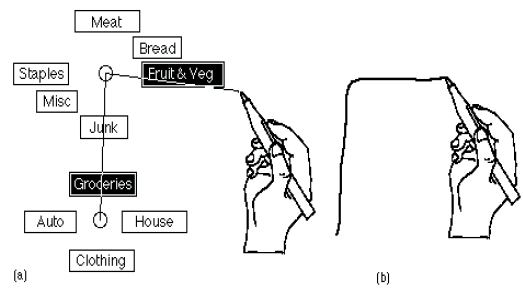
Kurtenbach and Buxton (1993) built on this idea and developed a pen-based system that recognised the shape of the "gesture", so the user did not actually have to open the menu items:
True gesture-based interaction would occur using video recognition or glove-based gesture recognition. In video gesture recognition, one or more cameras are required, and sometimes you need to put markers on the hands - gloves or thimbles on the finger tips, usually. This is less of a hassle for the user than "full glove" systems, but more processing power is required to recognise the position and shape of hands and figures.
In glove-based gesture recognition systems, a glove with sensors is used to track finger and hand positions, so less processing needs to be done to get the position of the hand and fingers - this comes from the sensors, but the gesture still needs to be recognised. Another similar concept is the pinch glove, which allows users to grab virtual objects. This does not recognise the position of the hand or fingers, but instead works by touching two or more of the sensors together, which is much simpler computationally.
One of the key problems with gesture recognition is how the recognition system knows when one gesture finishes and another starts. Krueger created a solution involving time cues - if the hand is held still for a certain time, a beep is heard indicating that it has been fixed, which creates an analogy to holding something in place whilst glue is drying, but this could be tiring and irritating.
Often, to ensure accurate gesture recognition and an intuitive interface, constraints are placed on the system. Common constraints include a region defined as the "active zone", and gestures are ignored if they are performed outside of the zone, and gestures are defined as starting from a set start position and a (different) end position, and the gesture is identified as the movement between these two positions. By having this start and end position, gestures can be strung together without confusion.
Like Grice's maxims for speech based interactions, Baudel and Beaudouin-Lafon came up with a set of guidelines on how to develop gesture based interaction systems:
- Use hand tension, e.g., tensing the hand into static postures - this makes the users intent to issue a command implicit. Tension also emphasises the structures of human-computer dialogue. Conversely, end positions should not be tensed.
- Provide fast, incremental and reversible action - this is one of the most basic principles for direct manipulation adapted for gesture-based input. Speed is essential to ensure that the user does not get tired forming gestures and reversibility is important to enable the user to undo any action, and incremental actions are vital for the system to provide continuous feedback to improve the user's confidence in the interface.
- Favour ease of learning - in symbolic gestural interfaces, a compromise must be made between natural gestures that are immediately learnt by the user and complex gestures that might give greater control and complexity of functionality. For example, you could map the most common interface actions to the most natual gestures to ensure ease of learning.
- Hand gesture should only be used for appropriate tasks - it is important to choose carefully the tasks that gesture input is going to be used for. While gesture input is natural for some navigation and direct manipulation tasks, it is inappropriate to tasks that require precise interation or manipulation.
Gesture-based interaction seems very interesting for some applications, where actions are dominant and one may be talking (not to the computer, but to colleagues, audience, etc). In the real world, gestures and speech are combined to create a communication, which is surely what we want to aim for with human-computer interaction. Solutions do exist, but they are rather clunky - for example, in a speech based word processor, how to distinguish content from editing.
Lots of research is being done into this form of multimodal interface, so these may be the real future for HCI.